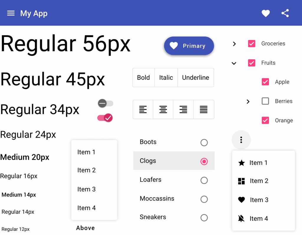
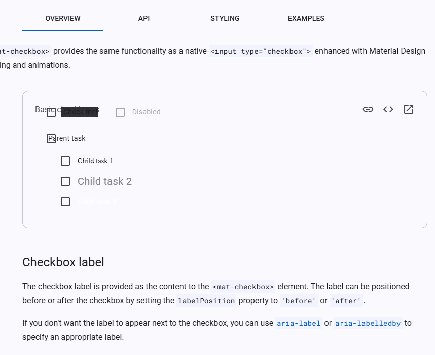
When starting a new Angular/React project, few developers give proper consideration to their UI component strategy. The standard approach is straightforward: import Angular Material or another popular library, and move on to “more important” tasks. It’s quick, it’s easy, and it works — until it doesn’t.
The False Economy of Component Libraries
I’ve witnessed this pattern repeatedly throughout my career. A project begins smoothly with pre-built components handling everything from buttons to complex autocompletes. The team celebrates their velocity, and stakeholders are impressed with the rapid progress. Then, inevitably, custom requirements emerge.
Consider this common scenario: “We need to modify the Autocomplete so that when a user types three letters, those exact letters appear bold in the suggestion list.” Simple enough, right? Not with third-party components.
What follows is a desperate dance of increasingly problematic workarounds.
I often see in Angular:
ViewEncapsulationtoNone(a recognized anti-pattern),- Overriding styles that were never meant to be overridden (with hundrends of CSS lines),
- Executing internal/private functions from third-party component JavaScript code(!))
Performance Impact
Component libraries often contain code you’ll never use – dead code that still makes it into your production bundle. Angular Material weighs several megabytes, even if you only use three components. The situation becomes even worse when you create your own wrappers around external components. Your bundle then contains duplicate code: the original component (often in its full version, even though it’s not being displayed), plus your abstraction layer with custom styles and logic. Own components allow for precise control over application size and including only the code that is actually needed.
The Technical Debt Time Bomb
Recently, I consulted on a project heavy with such “sculptural” modifications. The codebase was riddled with workarounds and style overrides for Angular Material components. Performance suffered, but things functionally worked — until the team needed to upgrade from Angular 12 to 15.
Angular Material 15 introduced numerous breaking changes, as library maintainers have every right to do. The upgrade broke virtually everything. The meticulously crafted overrides no longer targeted the correct elements. Dropdown positioning changed. Form controls behaved differently.
This topic often comes up on the internet, and everyone who has taken part in a larger project comes to the same conclusion.
Facing a tight deadline, the team did what seemed necessary: they added new layers of “sculpture” on top of the old ones. The result? A barely maintainable UI layer where even minor changes threatened to collapse the entire house of cards.
The shadcn Approach: A Better Alternative
This isn’t a critique of Angular Material—it’s an excellent library. The issue lies in how we approach component libraries in long-term commercial projects.
Libraries like shadcn offer a compelling alternative. Instead of importing black-box components, you receive source code that you can fully own and customize. Yes, this approach requires more initial investment as you adapt and extend these components to suit your needs. However, you gain complete control and independence.
With this approach:
- Custom requirements become straightforward implementations rather than hacky workarounds
- Your components evolve with your application rather than fighting against it
- Framework upgrades remain manageable since you control the update process
- You avoid the cascade of technical debt that comes from circumventing component libraries’ intended usage
Making the Right Choice for Commercial Projects
For short-term projects or MVPs where time-to-market is paramount, pre-built component libraries make perfect sense. But for commercial applications intended to evolve over many years, consider the total cost of ownership.
The time you save initially by using third-party components is often repaid with interest when custom requirements emerge—and they always do. By owning your component library from the start, you’re making a strategic investment in your project’s maintainability and longevity.
The next time you start an Angular project, resist the temptation to simply import a component library and move on.
Ask yourself: How unique will our UI requirements become? How long will this application live? And most importantly, who should control the destiny of our UI components—us, or a third-party library whose priorities may not align with ours?


